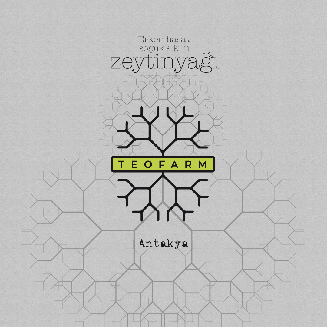
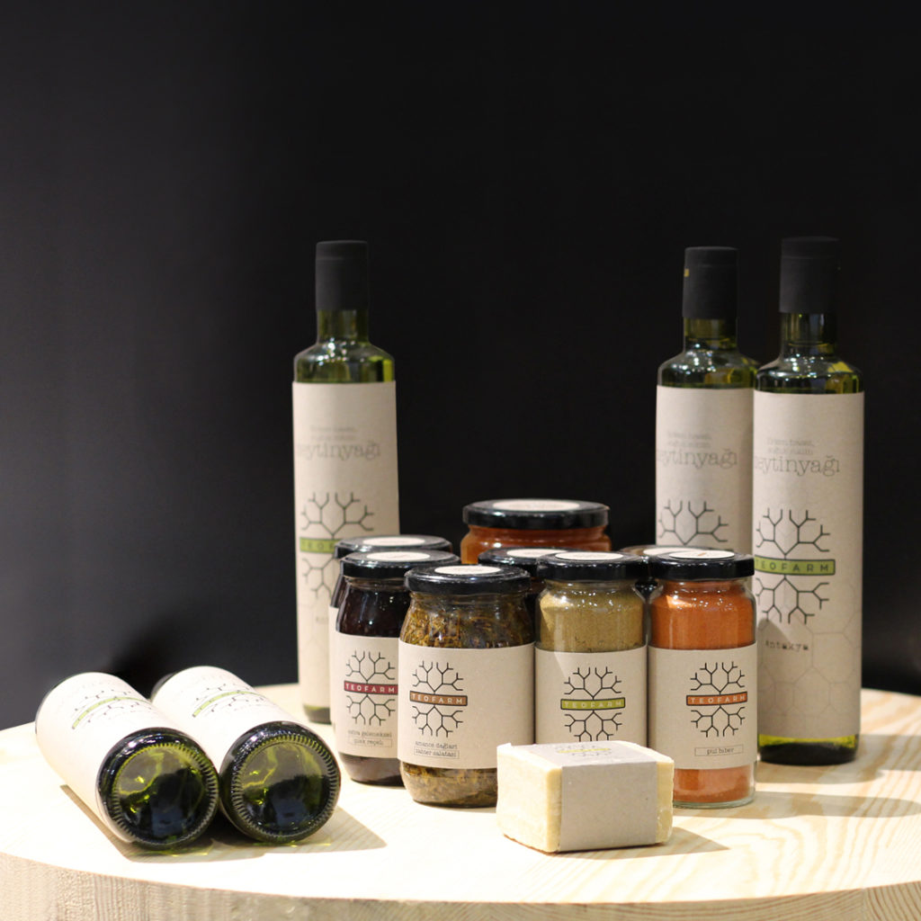
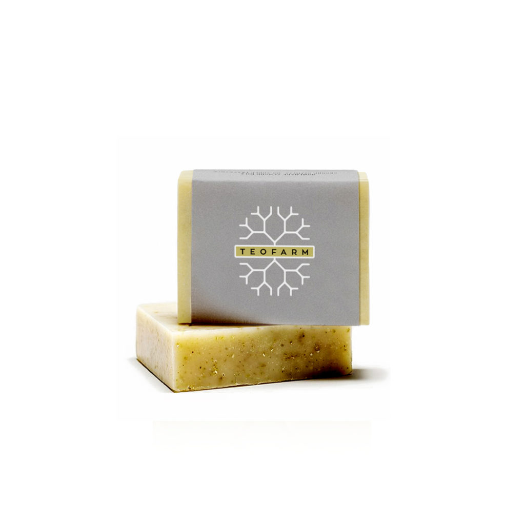
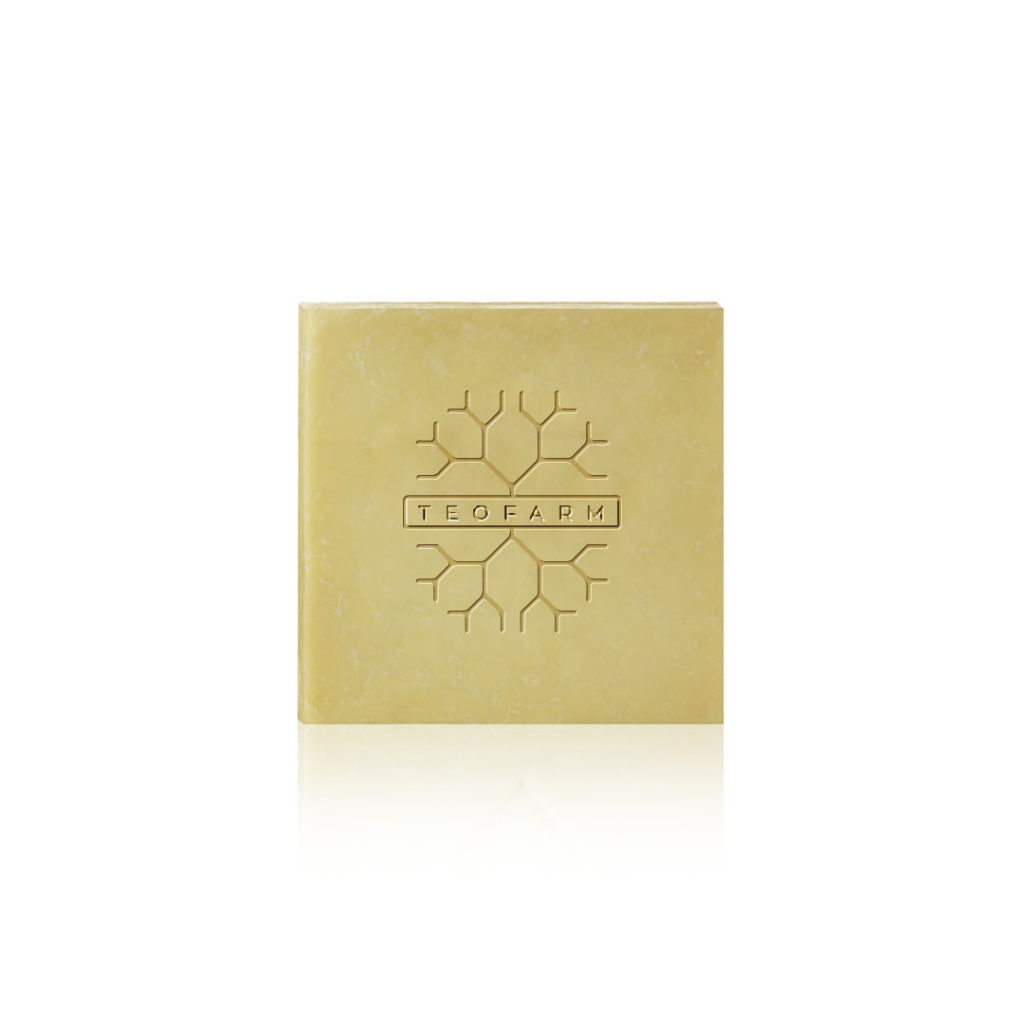
A farm and a family dedicated to agricolture since generations. This was the starting point for elaborating a new logo and brand image. The outcome is a new sign inspired to the ancient symbol of the “Tree of life”, re-mixed with the “Fractal tree”, the graphical result of a complex parametric equation. The logo is simmetric on the horizontal axis to symbolize that deep roots, both physical and cultural, are necessary for obtaining good cultivations.
Design: Mirko Tattarini
Staus: applied
https://teofarm.com/


